22.10.10

Show reel Workshop

Final Cut Express
Set up: default NTSC (American)
change to DV-PAL anamorphic (good for After Effects wide screen)
I have set up the system settings to save work to my User work folder because it has a lot of space to store temporary files such as RAM previews, when viewing progressing work.

The Final cut express work panel appears very similar to After Effects, with two viewing screens, a project panel and a sequence panel, consisting of two bars below. Blue for video and green for audio.

To place a video into the sequence timeline, simply click and drag into panel. (spacebar, to play back)

Trimming in final cut. Position curser in time ruler to where you want to cut, yellow line should appear. Then click and drag block to snap into line, cutting that section of video.
(N) turns snapping on and off
(shift+Z) to see whole sequence

Clip over lays
black line alter opacity, use pen tool to add key frames.
can take off audio, when un checked symbol

Use slug to create even amount of space.
select space and delete to remove space.
Text can be inserted, however view margins grid and don't write outside these margins.
Text is on transparent background so can be placed over footage.

Export as H264
Sequence - Render all.
File - export -quick time player
can put in clips of different sizes


Print workshop


21.10.10

T-shirt development

I have generated a few mock ups and applied some of my illustrated prints.
This first design is for a man's printed top. I think the monochrome bear design is working well and this is my favorite layout and logo combination. However I will need some feed back from other men to find out if they would like it or consider purchasing it. Also find out any other modifications i should make or things i've missed out regarding design.


The stock photograph originally look like this with it's on tag labels. So using a variety of clone stamp, selection and copy and paste tools in Photoshop I managed to remove the labels and apply my own design.


This alternative design is quite nice to. I haven't shown it yet but the large print is supposed to continue round the back of the shirt.


I have also produced a mock up for the a women's vest top design. I placed the gun image and adjusted to appear as if it is naturally printed on to the top using the warp tool. I then added a couple of gradients and tried to draw in some natural shading. Again I removed the original labeling and added my own.


20.10.10

Photography concept for cover design (idea 1)


I found this amazing photo of a zebra face and thought this would work well to illustrate the front cover. I like the bold, symmetrical, striped pattern and strong black and white contrast. Through this image I have chosen to illustrate the 'horror' side of the novel, a part I remember well, is a highly descriptive scene where by the Zebra is viciously eat alive.

As the indian boy 'Pi' and the tiger are actually the two main characters in the story and not the zebra. I considered adding an orange gradient to the Zebra image to make stripes look as though they belonged to a tiger. However this didn't work well and I found the red gradient gave a more dramatic 'horror' tone and indication to the zebra's fait.

The typeface has been changed a couple of times. I originally chose a large, bold font set in capitals and slightly eroded, because I though it would give the sense of being on a ship or out at sea (the setting of the novel). But I didn't see it working and it wasn't giving off the look I was after. So I have changed the title to a serif font for clarity.

Overall I think using photography is a good media option for this project. But if I do decide to go down this rote I intend to use my own photographs. However I will continue experimenting to see what else might work.


I thought I'd do this design as an alternative, using a photograph I'd taken myself. I don't like it as much as the zebra one, probably because the tiger is in a strange position. Also the tiger is on land in this photo and in the book it is out at sea on a boat.... I think the black against the green is a mistake too. I do like the new layout of type though, moving the authors name to the bottom of the page and informing that it is a novel, I have changed the choice of font again.

As the novel is written in the first person, from a young boys point of view, I think the font of the front cover's title should reflect this. In some ways childish.

Life of Pi Font choice

19.10.10

Wrapping paper development (Wedding theme)


In both crits people have mentioned they like this spotty design. So I will be printing this and apply it to a 3d object to see how it looks in use. Then i will consider applying it to further products, gift bags, tag labels, it might work nicely on tissue paper .


I've been looking at confetti patterns for the wedding themed paper. The designs haven't turned out as interesting as I thought. So I'm going to do some more research and head back to the drawing board for a more interesting and appealing design.

18.10.10

Snow flakes


In the previous designs I think my snowflakes have been working well so I have been experimenting with them. Interesting idea, but in the designs above I think the Gaussian blur is to extreme.


Owl and penguin gift wrap.

Looking back at my design context blog I found this sweet vector 'owl' gift wrap print. I thought I'd have a go and do a Christmas version, so instead of owls and leaves I've used penguins and snow flakes.


made from...


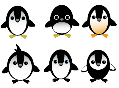
I have tried incorporating this penguin vector into my previous design development. However I think the styles are two different and clash. I think these penguin characters would appeal more to a child market.

17.10.10

Some more experimentation


I wanted to create more of a hand crafted feel so instead of using the default basic vector line I changed it to a charcoal texture.


I'm happy with this rain dear pattern, although it has no obvious repartition, I think it works well with the rough hand draw style of vectors. I think the colour works quite well too, perhaps more towards a female target market.
If I was to print this design and wrap it around around 3D objects the imagery would start to appear upside down if placed at different angles.

The designs below are horrible! Just some examples of trial and error i did before I came up with the design above.


I'm still working on the colour scheme to make it appear more in tone with Christmas.

(Christmas theme ) part 2 penguins?


16.10.10

Wrapping papper design development (Christmas theme)

At the moment I'm generating the vectors i'll be needing to create the patterns with. I haven't decided on a colour combination yet, but once I've got the shapes and patterns sorted for the three themes I'll use colour to tie them together as a set.


This grid didn't work as well as I wanted.


Here are a few more layout ideas using repetitive patern


These designs are the best so far, however still need attention their colour combinations and layout.