Showing posts with label Competition brief. Show all posts
Showing posts with label Competition brief. Show all posts
14.12.10
Tron hand outs in context
These hand outs could be placed in to magazines for advertisement and promotion. I thought the magazine 'total Film' would be appropriate and best suited to raise awareness of the new Tron movie. The magazine is full of the latest movie information, aimed at a regular male target audience who enjoy films.
I have photographed my designs placed in the magazine as a possible context for them.


I probably shouldn't have used my own hand to turn the page it looks to feminine for a product aimed at men. I haven't got time to re shoot so I'll probs use the top image because it could be mistaken for a mans hand.
Tron postcards completion
Finally finish Tron postcards.
I couldn't decide which design to develop so decided to produce three and pick one from them to submit into competition.
I am very happy with how this project has turned out. Shame about photograph quality, they would have been better if taken in photo studio with controlled lighting.
Design 1


Design 2

 Design3


Final set of three postcards to promote the movie tron


I couldn't decide which design to develop so decided to produce three and pick one from them to submit into competition.
I am very happy with how this project has turned out. Shame about photograph quality, they would have been better if taken in photo studio with controlled lighting.
Design 1


Design 2

 Design3

Final set of three postcards to promote the movie tron


10.12.10


9.12.10
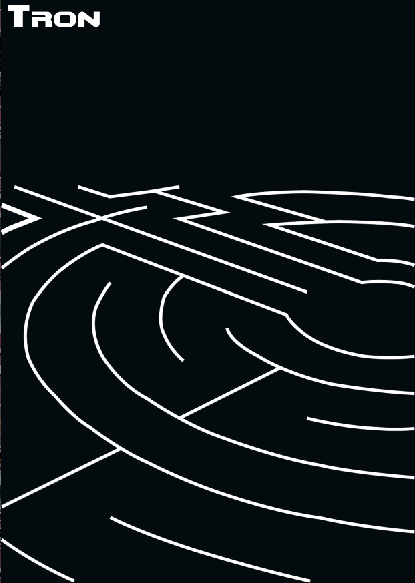
Labyrinth idea
Today I have had a discussion with a few people and all agree the labyrinth concept is the strongest and clearly communicates the theme of hidden places.
After more research I have a clearer idea of what the film is about. A bit like the matrix the characters are lost in a digital world. So I want to communicate this in my design. perhaps looking at computer parts circuit boards ect may provide me with some more visuals.
I am also considering other ways of getting across the sci-fi aspect with out going for the obvious neon glow. Also I need to remember the use of this postcard is probably mainly to advertise the movie and therefore has to be desirable, something someone would want to pick up and own.


After some more design and experimentation, I think the monochrome is working well. Perhaps I could use a metallic foil which would also add to the sci-fi, techno theme. The design needs more work on the line shape, rounding the curves and applying a narrower line.
7.12.10
Hiding
Experimenting using just the neon strips to indicate characters and type.
Front view of character

This is the side view of the character holding and iconic disc from the movie. However I think this design is not very clear.

With the theme of hidden places in mind I have tried to create a 'space' in this image by drawing in a bright neon floor and a black background, so the viewer can't see the surrounding space. Its a bit boring though and still unclear to reason.
Front view of character

This is the side view of the character holding and iconic disc from the movie. However I think this design is not very clear.


With the theme of hidden places in mind I have tried to create a 'space' in this image by drawing in a bright neon floor and a black background, so the viewer can't see the surrounding space. Its a bit boring though and still unclear to reason.
Hiding the characters
I have been trying to think of interesting ways to hide these characters and realised it is actually very difficult, considering thy are covered in neon glowing strips.
So i have come up with this concept, with the character in the background trying to hide by stepping back out of the light resulting in only the neon strips being visible.

I added a lens flare to the helmet in this image, I think it gives it a bit of a shine and a 3d illusion.


Hidden places (tree house)
With this design direction I considered the hidden place of a tree house. This is a place children can easily relate too. So looking at some of the film photographs on my design context blog I picked out two of the main characters. I have then placed them in slightly childish poses, sitting on the floor and looking out as though they are up a tree looking at the view.
I then added the distinctive neon lights from the film onto their clothing and blurred blue neon light in the background and lens flare (something for the characters to be looking at)
I then added a patterned floor and altered the perspective as the ground for the characters to sit on. Then finally some trees to give the sense they are up a height and imply they could be in a tree house, I also added a couple of black walls to give a bit more scene on enclosure.


Positioning of text


6.12.10
Labyrinth idea
This project focus on the subject of hidden places. Considering the movie Tron is produced by Disney it is probably mainly targeted to a young audience, so i have been considering what places are hidden from a child's point of view. The first place that came to mind were labyrinths, a fun place to hide and get lost in.


I think the design works well to keep the neon sci-fi look, however the concept of a maze is to boring and a bit obvious as a hidden place. so back to the drawing board i think.
Also i think the purpose is unclear, the word Tron steals the focus. Perhaps the lens flare is to much as well.


I think the design works well to keep the neon sci-fi look, however the concept of a maze is to boring and a bit obvious as a hidden place. so back to the drawing board i think.
Also i think the purpose is unclear, the word Tron steals the focus. Perhaps the lens flare is to much as well.
1.12.10
Subscribe to:
Posts (Atom)