28.11.10

Photographed product female range


I think I should have taken more images of the T-shirts as a set.
I captured some nice close up detail of the tiger print and label.

Photographed product

Christmas theme
The gift wrap design displayed and wrapped round a large cube gift box, with ribbon accessory.


I am very pleased with the turn out of the Christmas themed gift wrap, product photo shoot. I have taken close ups focusing on the pattern, they have come out with a lot of detail, even the slight shimmer on the ribbon.
If I was to photograph again I probably wouldn't wrap the ribbon round all sides of the box as it has covered a lot of the pattern up.

These photographs do well to demonstrate, no matter which direction or angle someone chose to wrap the paper the design will always appear to be the right way up and not upside down.

Oh I should mention this is printed CMYK on fire proof paper stock. I thought fire proof would be most appropriate for Christmas wrap because people usually place their Christmas presents under a light up tree which can be a fire hazard. Extra paper around the presents would just help full the fire, if caught alight. However this would not be the case with this design.
The type of stock is also thin enough to wrap and bend easily around 3D objects. Whilst staying flat and crease free on flat surfaces, such as the sides of this box.

Photographed product

Wedding theme


I should have straightened the gift bag handle out. Perhaps in blue instead of yellow, or pink. Perhaps I should of had a shot of some one holding the products to give a better sense of scale.


I did well to balance the roll of paper like that, it took a while lol. The contrast is a bit too high.

27.11.10

Alternative design direction

This design direction failed.
I was trying to produce an image similar to the design on my design context blog.


Photographed in use

Mock of poster displayed on advert tower in Leeds city center, outside a popular nightclub.

Photograph of of product being held to give a sense of size and scale

Poster development

Alice in wonderland design.
This classic British story was written in Victorian times. It was also illustrated so i thought this would be a good starting point to develop the vintage style poster for urban outfitters.
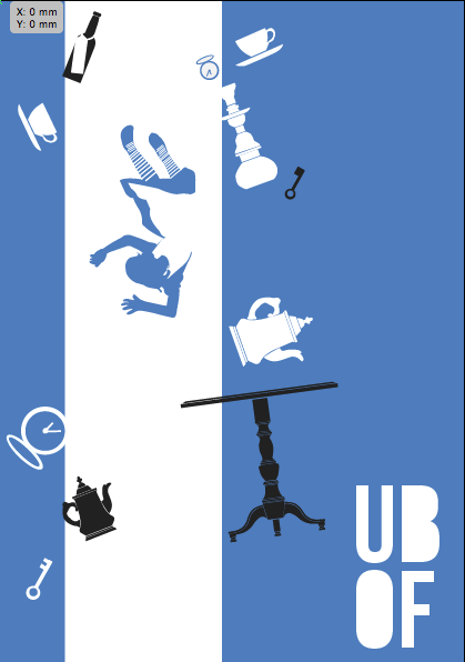
A chapter i well remember is when Alice falls down the rabbit hole past lots of objects. The female section of urban out fitters is located down stairs so i thought this image would work well on the wall of the stair case. Plus from my research I found they sell lots of vintage things which are mentioned in the story. (tea cups, pocket watches, lamps etc.)
The image seems very cluttered and disorganized. Although I wanted this look, it is hard to distinguish what the main elements are of.
To try and help I have included another color, but this didn't help much.


Oliver Twist
" I want some more" is a famous quote from the book.
I find with urban outfitters their customers tend to buy things they want appose to what they actually need. The fact Urban outfitters has a vintage section is a good example of why people shop there, to own something one of a kind.
So i have done this design of a pocket watch from the novel Oliver Twist, a symbol of what someone wants.


The simple vector style and bright colour scheme is supposed to make it appear modern. However I am struggling with the colour scheme.

On shop front
I like the yellow and blue combination on the shop front and think it would appeal to young adults.

Wrapping paper branding

In shop banners


Bag designs


Swing Tag designs

size 8cm X 4.5cm
Front and back


I think this illustration of a deer i draw but didn't include on the t-shirts works well combinded with the scripted font used to brand All Saints. I don't really like it though and think the type and image are a bit pretentious.

26.11.10

Photographed product


Tiger t-shirt mock ups

I have intended to apply the 'animal' themed prints to only the male range and the 'objects' theme to the female range.
I have made a couple of mock-ups and applied the tiger design to a male top. It's a nice design but I think the tiger looks to "soft" and would probably appeal more to a female target market.


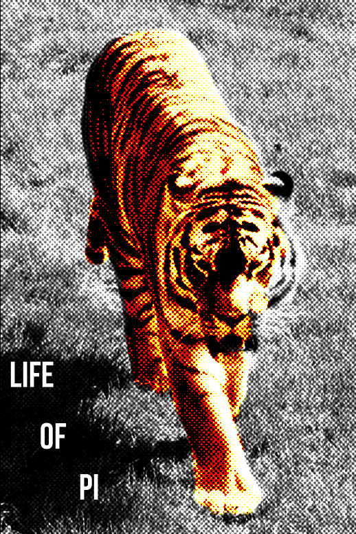
The tiger doesn't look any better inverted on a black top.

So I will be placing the tiger print on to a female top.
I have produced a few more mock ups considering the scale and positioning of the tiger print.

White vest top with scope neck


Grey vest top with scope neck and back


I think the design will be more desirable as a small motif printed in black pigment on a gray vest top.

A more colourful approach