This classic British story was written in Victorian times. It was also illustrated so i thought this would be a good starting point to develop the vintage style poster for urban outfitters.


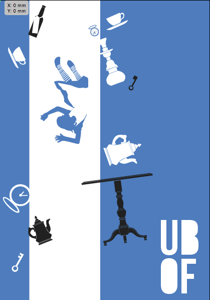
 A chapter i well remember is when Alice falls down the rabbit hole past lots of objects. The female section of urban out fitters is located down stairs so i thought this image would work well on the wall of the stair case. Plus from my research I found they sell lots of vintage things which are mentioned in the story. (tea cups, pocket watches, lamps etc.)

The image seems very cluttered and disorganized. Although I wanted this look, it is hard to distinguish what the main elements are of.
To try and help I have included another color, but this didn't help much.
Oliver Twist
" I want some more" is a famous quote from the book.
I find with urban outfitters their customers tend to buy things they want appose to what they actually need. The fact Urban outfitters has a vintage section is a good example of why people shop there, to own something one of a kind.
So i have done this design of a pocket watch from the novel Oliver Twist, a symbol of what someone wants.


The simple vector style and bright colour scheme is supposed to make it appear modern. However I am struggling with the colour scheme.
On shop front
I like the yellow and blue combination on the shop front and think it would appeal to young adults.


No comments:
Post a Comment