Through out this module I have aimed to push my working practice and as a result I feel I have produced some of my best work yet on this course so far. However there are many aims I still have not yet fully achieved, which I had stated in my rational at the start of September.
Writing the rational at the start of the term and selecting appropriate briefs I felt confidant I had a clear direction and area of graphic design I wanted to study and pursue my design practice in. I knew I wanted to focus on image so developed each brief to explore a different context and application of illustration and design in that area. I had a positive work experience in July, so also wanted to produce work appropriate to that sector, for the entertainment industry.
I originally had four briefs that contained all aspects proposed in the rational. Consisting of 1. book cover design brief which I had the intention of developing into a larger brief of promotion, advertisement and motion graphics for on screen delivery. This would be the main brief of the term 2. Printed t-shirts brief that would give me the opportunity to screen print, a process I wanted to learn. 3. A Poster brief, quick turn around 4. Gift wrap brief again another quick turn around to produce work using repetitive image and investigate commercial printing process.
I stuck to this plan for the first month and got underway researching into each brief with most time focusing on the book cover brief. Shortly I started my design practice, it was then I spent most of my time a focused on design for the Gift wrap brief because I wanted to finish it in a few weeks. However this did not happen as the process took longer then I originally anticipated and the project continued on through to November. I enjoyed this brief and improved my vector design skills and use of illustrator for repetitive pattern however I found my use of colour a challenge and its something I need to work on and improve.
I think my time management for the t-shirt brief was spot on. Starting with clear research and direction solved by October I started illustrating and produced some nice imagery for print. I was happy with the images produced for the animal range however should have produced a larger quantity of imagery for the female range and as a result I ended up applying an animal design that was intended for the male. I allowed my self time for trial and error in the screen printing room as I haven't used this print process before. I produced a set of tops I am happy with and was very please to hear other people liked them and offered to model them for me. From the positive achievements happening with in this brief I devoted more time to it and booked an early slot in the photography room, a decision I was pleased with because I generated some quality photographs and documentation for the final boards.
During October I had gathered some interesting photographs over the Halloween period and was inspired to incorporate them into a brief. As this was an unplanned brief, I spoke to tutors and peers for assurance and clarity in order to resolve it. I sore it as a quick turn around, a one week project. so put the other briefs on hold and got started. I enjoyed this brief experimenting with effects and possibilities using Photoshop, a piece of software I wanted to develop and had stated in my rational. I also experimented with different formats of paper and layouts and found myself paying more attention to the combination of type and image. Again similar to the Tee shirts brief as this project developed it became a bigger priority to the other briefs and this one week brief went on for over a month.
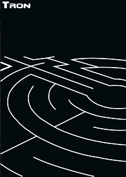
I read over my rational and knew I wanted to do a brief that was more specific to the entertainment industry. With a bit of research I found a 'Don't panic' brief based on the new release of a movie called Tron. I thought it was perfect for what I wanted to learn and develop skills in. With a resolution of image based print for the entertainment sector.
This brief was mainly Illustrator based. I drew up a few initial sketches and scanned them into the computer to generate vectors from. Most of the sketches were far to detailed for this process and time consuming to reproduce so I took to using references from the original film stills. I now feel very confident using the pen tool and enjoy drawing in this way. From my research I thought it would be important to apply similar visual effects as used in the film, to make a larger visual connection. So applied similar effects I had learned from the 'Halloween' brief. With more research I felt these vectors didn't portray the modern/ 80's look I was after. I was also aware that the 'neon glow' may not print as it appears on screen. (a previous disappointing result with the print quality of the 'Halloween' brief)
After another crit I considered alternative printing processes to create the high tech, modern/80's look I was after for the Tron cards. I chose the metallic foil press to be the most effective process for this visual result. I chose one of the simplified designs to apply this process to for clarity.
I was now into December and new the book brief was not going to be as big as I had originally planed. I did not want to rush it but found myself doing so as I tried to complete it on time alongside the urban outfitters poster brief. I had also thought the book cover brief would be quite straight forward and I would achieve my best results with it. This was not the case and I think my poster brief had a better turn out in comparison.
I am disappointed that these two briefs were not resolved to the best of my ability and suffered due to bad time management. I do quite like the poster resolution to the Urban Outffiters brief though it could have been pushed forward further with more development work and applied to a range of different books.
During this term i am well aware this is my final year so wanted to make the most of it and singed for extra workshops in print, motion graphic and photography. These proved to be very useful particularly print and photography and helped the delivery processes on most projects. However due to time management and cancellations of the motion graphics workshops I did not produce any motion graphics resolution that i had originally stated in my rational. But i did produce a few test compositions and experimentation in flash. I can apply these new skills to other briefs, perhaps next term.
Over all I am happy with how this modal has turned out. I am producing work to a higher level then previous and have learned new appropriate skills and processes. I am also starting to consider how my design practice could be used in industry. Although I am aware the projects are not to the professional standard yet I think i have show progression.
16.12.10
15.12.10
14.12.10
Tron hand outs in context
These hand outs could be placed in to magazines for advertisement and promotion. I thought the magazine 'total Film' would be appropriate and best suited to raise awareness of the new Tron movie. The magazine is full of the latest movie information, aimed at a regular male target audience who enjoy films.
I have photographed my designs placed in the magazine as a possible context for them.


I probably shouldn't have used my own hand to turn the page it looks to feminine for a product aimed at men. I haven't got time to re shoot so I'll probs use the top image because it could be mistaken for a mans hand.
Tron postcards completion
Finally finish Tron postcards.
I couldn't decide which design to develop so decided to produce three and pick one from them to submit into competition.
I am very happy with how this project has turned out. Shame about photograph quality, they would have been better if taken in photo studio with controlled lighting.
Design 1


Design 2

 Design3


Final set of three postcards to promote the movie tron


I couldn't decide which design to develop so decided to produce three and pick one from them to submit into competition.
I am very happy with how this project has turned out. Shame about photograph quality, they would have been better if taken in photo studio with controlled lighting.
Design 1


Design 2

 Design3

Final set of three postcards to promote the movie tron


13.12.10
Final Urban Outfitters Posters

Ok I'll admit i have rushed this project. I haven't taken this poster much further in development. I thought the previous designs were to 'crowded' so I have taken quite a lot of the objects out. Even though there are less objects I hope the viewer still gets the scene of the girl falling down past floating objects.
12.12.10

Vectorised design
As the novel is set out at sea I thought it would be interesting to create a patterned image that looks like, water ripples, zebra stripes and tiger stripes.
I gave up trying to use the trace tool on the tiger and zebra photograph because i couldn't get it to work. so instead I used the pen tool and draw out what i wanted. This was very time consuming and the visual result isn't as good as what i had in mind.

I added some orange and blue to try and reference tigers and water.


This design is not the best back drop for legible text.
I still needed to communicate the zebra so did this design to.


This zebra image isn't working because I want the viewer to sympathize with the character, not be scared by it. Although the novel is quite sinister the zebra is not.
Perhaps I should stick to the photograph version.
11.12.10


Online promotion and point of sale (Male)
click on images to see more detail and written information of each web page.
Men main menu designs
I've decide to include one impact image on this menu that sums up the male range. The customer would then navigate through the information located at the top of the page.
 Product information pages
Navigating the top menu will lead the viewer to click on (Graphic Tees) from there icons of the full range will appear. Then details of each individual top design can be easily located.


Online promotion and point of sale (Female)
Women main menu designs
I've decide to include one impact image on this menu that sums up the female range. The customer would then navigate through the information located at the top of the page. Below are the three possible ideas


Product information pages
Navigating the top menu will lead the viewer to click on (Graphic Tees) from there icons of the full range will appear. Then details of each individual top design can be easily located.


Female range modeled
Sadly I was unable to get a place in the photography studio. So just had to make the most of a white room and natural light for this photo shoot of the female range.
I think my photography skills have let down the quality of the images. When the flash was used there was too much reflection and when not used the images were to dark. So I'm going to spend some time adjusting them in photoshop.
Black vest top
'Gun' illustrative design
size 8


The 'guns' top is a bit more 'grungy' with a 'rocker' style, different to the others so I asked the model to wear gray 'skinny' jeans to complete to look. That is way I have included the bottom image to bring a bit of 'personality' to the top.
Grey Vest top
'Tiger' illustrative design
size 10


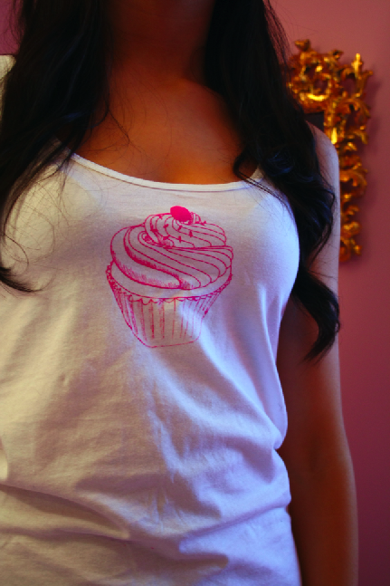
White vest top
'Cup cake' design
size 8


 Looking back now i think it was a mistake to have a pink background, I should have kept it white, same as the others.
I did a black version of the print and then thought it best suited pink. However now I think the design is not part of the set, colour, stlye, tone...ect So I don't think i'll be using this t-shirt again through the rest of the brief.
In photography studio photo shoot of female range
Tiger top kindly modeled by Heather and Chloe.
A nice set of images, lighting is good with a clear quality. I think the gray background was a good choice to. However I think the photos focus to much on the model then demonstrating the printed design. That is my fault with focusing.


The Bear design could be applied to woman's tops to
I think it suites Rebbecca nicely. Lovely with her red hair.


I think my photography skills have let down the quality of the images. When the flash was used there was too much reflection and when not used the images were to dark. So I'm going to spend some time adjusting them in photoshop.
Black vest top
'Gun' illustrative design
size 8


The 'guns' top is a bit more 'grungy' with a 'rocker' style, different to the others so I asked the model to wear gray 'skinny' jeans to complete to look. That is way I have included the bottom image to bring a bit of 'personality' to the top.
Grey Vest top
'Tiger' illustrative design
size 10


White vest top
'Cup cake' design
size 8

 Looking back now i think it was a mistake to have a pink background, I should have kept it white, same as the others.
I did a black version of the print and then thought it best suited pink. However now I think the design is not part of the set, colour, stlye, tone...ect So I don't think i'll be using this t-shirt again through the rest of the brief.
In photography studio photo shoot of female range
Tiger top kindly modeled by Heather and Chloe.
A nice set of images, lighting is good with a clear quality. I think the gray background was a good choice to. However I think the photos focus to much on the model then demonstrating the printed design. That is my fault with focusing.


The Bear design could be applied to woman's tops to
I think it suites Rebbecca nicely. Lovely with her red hair.


10.12.10


Subscribe to:
Posts (Atom)